Tampilkan postingan dengan label resources. Tampilkan semua postingan

Jumat, 16 September 2011

Free vector ornaments and frames

The other night I was designing something for a friend's wedding and needed some fancy curlicues. I could make some—but I'm lazy. I opted for a quick internet search for free vector graphics and found lots of useful goodies.

If you have a vector editing program like Adobe Illustrator, you might be interested in these from the Vector Graphics Blog:
Ornate design elements
Vintage decorative elements
Vintage decorative frames
Vintage ornate frames

Plus lots more where those came from. A word of caution: you'll need to navigate through a minefield of advertising links to get these, so be careful what you click. Skip the Google ads and click "Download link" midway down the page. When directed to MediaFire, ignore all the large flashing buttons! Look for the name of the .zip file and directly underneath, choose "Click here to start download from MediaFire."

Kamis, 08 September 2011

Styled magazine: free DIY ideas, recipes, and printables

The second issue of Styled magazine hit the internet yesterday, and it's lovely! Full of beautiful photos, recipes, DIY ideas, and entertaining tips, this issue's theme is autumn merry-making.

My favorites were the DIY gilded bottle project and Melissa Esplin and Jill De Haan's pretty six-piece printable party stationery set. The best thing about online mags are the clickable links, so don't miss a single free download, product source, or project tutorial.

Flip through the entire magazine online, read the PDF on your iPad, or buy a printed copy right here.

Senin, 29 Agustus 2011

Funny things for graphic and web designers

While poking around Don't Fear the Internet, a site that teaches non-web designers (like moi!) how to make a website, I found this desktop wallpaper. If you've ever monkeyed around with code, it will make you giggle. The wallpaper is from Jessica Hische and Russ Maschmeyer, the masterminds behind the website.


Speaking of giggling, you might be familiar with the fake Latin text Lorem Ipsum that designers stick into their layouts as placeholder copy. Lorem Ipsum is available in a variety of awesome and inappropriate flavors. Designers, check out Hipster Ipsum, Gangsta Lorem Ipsum, and Bacon Ipsum. Or head over to the Greeking Machine to pick up some Hillbilly, Marketing, or Pseudo German Ipsum (though this last site could do with a few more short words and articles to mimic the rhythm of real copy). Enjoy.

Senin, 01 Agustus 2011

Free, high res paper and canvas textures

If you're a designer in need of digital textures, check out the free canvas textures at Fuzzimo and some paper textures from Dioma. CG Textures also offers plain, decorative and wallpaper backgrounds in their "Paper" section. (Setting up a free account is needed to download high resolution versions there, but it's well worth it).

To get Deming, the font I used in the graphic above, click here.

I use background textures on brochures, websites, headers, and more. If you have portfolio pieces or stationery designs you want to show off, consider layering the digital image on top of a fabric or paper background in Photoshop. Add a drop shadow, and you've got a lovely, fake "photo" of your piece. For inspiration, see how Minted.com presents their stationery products.

Kamis, 21 Juli 2011

Generate seamless Japanese patterns

At Pugly Pixel I discovered the Japonizer. It sounds like an Asian pro wrestler, but it's actually a pattern generator that creates seamless files for tiling—useful for Twitter backgrounds, websites, or your computer desktop. Choose a traditional Japanese pattern, select a size and your favorite colors, and download your file. (Should you need to generate a professional wrestling name as well, click here.)

Jumat, 17 Juni 2011

Edit images online with Photoshop Express

Even if you don't have Photoshop, it's possible to make simple corrections to your images using Photoshop's online Express Editor. It's super easy to use. Upload a photo from your computer to operate on. Select a tool in the sidebar, and instructions will appear at the top of the window telling you what to do. Fix red eye, crop, resize, adjust the exposure, lighting, or white balance, add text, and more. Then save the image back to your computer.

Rabu, 15 Juni 2011

More ways to view blogs

You're a free spirit. You need choices. Scrolling linearly through blog posts is so old school. Do you know about Blogger's dynamic viewing options? You can view any site powered by Blogger in one of five different ways: Flipcard, Mosaic, Sidebar, Snapshot, or Timeslide. Click here to test Flipcard with How About Orange. You'll see a photo from each post. Click on any picture to read the entire entry. Use the drop-down menu at the top to change views, and to see other blogs, click the "How About Orange" title and enter another URL.

Senin, 23 Mei 2011

Free, high res stock photos

I just came across Morguefile.com, a public image archive of free, high resolution stock photos uploaded by creative professionals. Help yourself to images for use in both personal or commercial work.

Rabu, 18 Mei 2011

Online SLR camera simulator

On the subject of photography, did you know there's a website where you can practice using an SLR camera? Adjust lighting, ISO, aperture, shutter speed, and distance settings to see what happens to your photos. Try out CameraSim.com.

Rabu, 11 Mei 2011

Paperless Post electronic invitations

In a blog post about electronic invitations two years ago I mentioned Paperless Post. Since then, they've been adding new card designs and making their site even better. And since then, I've been using their e-cards because they're the loveliest I've seen on the internet. The invitations look letterpressed on fine paper, and you get the virtual experience of opening a pretty envelope. They'll track your guests' responses, send reminders and the whole works—like Evite, only better looking. I'm a fan!

In case your suspicious mind is wondering, Paperless Post has not sponsored this commercial from Jess, though it probably sounds like one of those posts that bloggers write when they've been paid to give a glowing review, right? They do have a promotion where you'll receive additional free stamps for every friend that joins. So here, you might as well click this referral link if you feel like giving them a try. Above are some of my favorite designs.

Selasa, 29 Maret 2011

An icon search engine

Should you need icons for websites, presentations, or for replacing all the default icons on your computer desktop because you're crazy like that, Icon Finder is for you. Choose from bazillions of images, many of which are free for commercial use. Search by size, background color, and licensing options. (When viewing any icon, the license info is shown in the upper left corner.)

Kamis, 17 Maret 2011

Free, high res textures

I just came across Lost and Taken's texture gallery of free, high resolution images for use on personal and commercial projects. What a great resource! Choose from torn paper, book covers and end papers, cardboard, watercolors, scratches, clouds, and more.

Senin, 14 Maret 2011

Epic Letterpress machine reviewed

The folks at Lifestyle Crafts recently sent over a complimentary Epic Letterpress and Die Cut machine to try out and review. I received the Epic Combo Kit, plus a few different sets of plates, extra ink, paper, and cleaning cloths. I was eager to see what kind of results the letterpress would yield, since I go rather bonkers for deliciously textured designs pressed into thick paper.

I opened up the packages, including the plastic printing plates that came with the combo set. "That looks like trouble," I thought when I saw how warped they were. It's been over ten years since I've applied ink to anything with a brayer—I did a bit of block printing in college—but it seemed like rolling ink onto a bent piece of plastic would be challenging.

I selected a couple plates and secured them to the hinged lid with the provided adhesive stickers. Then I positioned a small card on the bottom board and added the foam placement guides so I could print multiples.

A test without ink seemed like a good idea, so I closed the lid and ran the thing through the machine. (I forgot to take a picture of that part, so pretend there's a business card and some plates under the clear lid in the photo above.)

Here's the result. Pretty nifty! Kind of wish I couldn't see the bottom edge of the plate under that "y," but I can deal. Let's get out the silver ink.

Rolled it out a bit in one direction, then the other, until it was nice and even on the brayer. Carefully applied the ink to the plates, and...

Ew, yucky. As I suspected, rolling ink onto plates that aren't quite flat is very tricky. I wiped the ink off and tried again. Rats. All the cards looked like they were made by a blind monkey. (Click any of the photos of prints in this post to view larger.)

Next I tried an all-over pattern on a bigger piece of paper stock that came with the machine. The print is much better because this plate was flat, but holy smokes. That paper must be much thicker than the smaller cards, because it used every bit of arm strength I had to crank it through. Granted, my arm muscles are virtually nonexistent, but I didn't expect it to be that hard. I had to crank in quarter turn increments while struggling to hold down the machine with the other hand, and I was constantly afraid I'd break off the handle. But all was well! The print looks good.

Let's try another one. This "thank you" plate was warped too, but I managed to get a seemingly even layer of ink on it. Lovely! But as I lowered the clear hinged cover, the plate fell off because the adhesive wasn't making contact in enough areas to keep it stuck to the lid. I reattached it and held it on with my fingernails while I closed the lid.

The result was a pretty good print.

After looking at the print more closely and cleaning off the plate, I see the "o" and "u" have little divots in the plastic, causing tiny flaws in the print.

If you're not a crazy perfectionist like me, this probably won't bother you. The photo at the top of this post shows the card I put together with a couple of the prints and some orange masking tape. It's respectable. But as for me, I think I'd rather leave the letterpressing to the pros since the struggle outweighed the fun. For another review and some excellent tips on getting the most out of the L Letterpress (including using better printing plates), see this post by Boxcar Press, a commercial letterpress shop.

P.S. A note about silver ink: 24 hours after making these prints, the ink wasn't completely dry and came off on my fingers. 48 hours later later it's improved, but I can still rub off silver ink from the patterned card. I suspect this is related to the particular pigments used in silver inks and paints. See this post about another non-drying silver paint experiment. I'm reasonably sure other non-metallic inks won't have this problem, however.

P.P.S. I gave it another go! See the results of my next letterpressing attempt here.

Selasa, 01 Maret 2011

A gallery of stationery

The folks behind Lovely Package have launched a spin-off called Lovely Stationery, a blog curating the best in business card, letterhead, and envelope design. Many projects feature delicious die cutting, embossing, foil stamping, and all sorts of expensive finishing no one can afford. Head over there and dream a little.

Selasa, 21 Desember 2010

Meet my friend Xyron

I didn't have any self-adhesive label paper in the house when I was printing gift tags, so I pulled out my Xyron machine. I first used one of these at a design firm to mount prints onto presentation boards, but it's so useful I decided I needed one for home, too. It's light years better than glue, little pieces of double-stick tape, or spray mount that takes two days to wear off of your fingers.

Place a sheet of paper on the tray and turn the crank to run it through the machine. As it feeds through the Xyron device, the paper is sandwiched between a clear plastic top sheet and an acid-free adhesive layer with a paper backing.

Peel off the top sheet and cut your print into stickers if you like. Then just peel the paper backing off each sticker to use them.

This machine will also laminate paper and make magnets with a laminate finish. The current model looks slightly different than my older one; you can find it here, at the major craft stores, or at Dick Blick and Amazon—cheaper!

Jumat, 12 November 2010

Easily customize your Twitter page

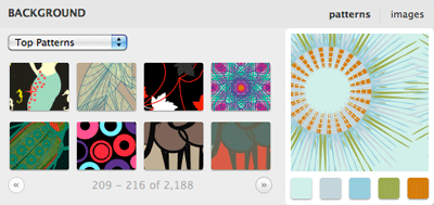
Themeleon by COLOURlovers is a tool for customizing your Twitter background. Try out different color palettes and themes, or choose from over 2,000 patterned backgrounds. Many of them are kind of hideous to my eyeballs, but hunting around a bit can yield some keepers.

Selasa, 12 Oktober 2010

Reverse image search with TinEye

TinEye is a reverse image search engine. Submit a picture, and TinEye will tell you where it's being used on the web. This could be very handy when you've saved an inspiring photo and can't remember where you found it. I tested it by searching for this photo of mine and found it on 24 sites. Interesting!

Jumat, 24 September 2010

My favorite graphic design galleries

The following sites are handy references and provide entertainment if you like looking at nice design. If you don't like looking at nice design and would rather see a gallery of Photoshop disasters, click here. (Be warned that some of the entries are rather risqué, so don't look if you are under 18. Of course, by saying that, I might as well put a giant flashing CLICK ME sign on the link.) But back to the good sites:

Logos: LogoPond
Business cards: Creattica
Letterhead: Letterhead Love
Websites: Site Inspire and The Best Designs
Packaging: The Dieline and Lovely Package
Invitations and cards: Oh So Beautiful Paper and Paper Crave

Kamis, 16 September 2010

Typography lessons for everyone

Friends, I've discovered a website that makes me giddy with joy: Typography for Lawyers (via Swiss Miss). If the words "typography" and "lawyers" don't usually make you giddy, bear with me. The site is a well-written, beautiful piece of work from Matthew Butterick, a typographer-turned-attorney. If you're a non-designer, this simple guide will help you make pages of words look better. And if you're a designer who's tired of telling folks to stop using two spaces after periods, send those peeps right over here to get them straightened out. And soon the world will be a better place.

Senin, 26 Juli 2010

How to add your portfolio to LinkedIn

If you're an artist, a designer, or a maker of nice things, you might be interested in Behance's LinkedIn portfolio application. It allows you to add images and video to your LinkedIn profile. Read an overview at SwissMiss or sign up here.